

Updated October 23, 2026. This guide now uses inspected image-ad examples and a practical research-to-layout workflow.
Static ads use a fixed image to communicate a message and invite an action. A useful static ad makes its main idea understandable in one composition: what the viewer is looking at, why it matters, and what to do next.
To create one, choose a supportable proposition, collect relevant image references, sketch the visual hierarchy, and check the finished design in its intended placement. A single frame can present a comparison, demonstrate a task, or show a product clearly. Its effectiveness depends on the message and context, not simply on being static.
This guide uses two real image ads found in Denote, then explains how to turn a reference into an original layout.
TL;DR
- A static ad is an image creative. A paused frame from a video is not evidence that the advertiser ran it as an image ad.
- Start with one reason to choose the product; let the composition make that reason clear.
- Invincible illustrates an earlier/later progression comparison. Crossmath presents a small arithmetic challenge directly in the image.
- Record the source, advertiser, format and observation date before interpreting an example.
- Test the finished creative using your own results. Chart visibility and observed duration do not prove conversion performance.
What are static ads?
Static ads present one fixed visual asset rather than a video sequence or animation. They can appear in social feeds, display placements and other image-supported inventory. A carousel can contain several static cards; each card still needs a clear job.
The distinction concerns the creative asset, not the entire delivery system. An image can sit inside a changing interface or an automated campaign. That does not mean the image itself is animated.
In practice, image research should identify both the argument and the visual device used to make it legible. A side-by-side comparison is a device; convenience or progression may be the argument. The ad angle guide explains that distinction.
Two real static ad examples from Denote
We inspected Trending Ads → Game → Image, completed week October 12–18, 2026, on October 22. Tags, platforms, countries, languages and operating systems were All; Remove Re-ads was off. We screened the first 12 listed image rows and opened the two references below for contrasting compositions.
Open the image-filtered source chart. This is a selected Game example set, not a survey of ecommerce ads or a ranking of image-ad conversion rates. The source-ad images are original files displayed in Denote's previews; the advertisers' artwork and copy are retained.
Invincible: make the comparison visible
The Invincible: Guarding the Globe image splits the composition into earlier and later character states. Labels and stats reinforce the contrast, while a prominent play button provides the next action. The accompanying caption links the proposition to idle progression and resources.

Original image ad displayed in Denote, recorded October 22. The depicted timeline and gains belong to the advertiser's creative and were not independently verified.
There are three useful layout decisions to inspect:
- The subject remains recognisable: the viewer can compare two states of the character.
- The composition creates a reading path: the side-by-side structure invites comparison.
- The next action is visible: the image contains a play cue, separate from the surrounding platform interface.
These are observations about hierarchy, not proof that the layout caused results. Some text and stats are small, so a team adapting the principle should check which details remain legible at its intended size.
Original application: if your product has substantiated earlier/later states, place them side by side and explain what changed. If you cannot support a timeline or outcome, remove that claim instead of using a convincing-looking comparison to imply it.
Crossmath: let the image demonstrate the task
The Crossmath image presents an arithmetic grid with missing numbers. Its short daily-puzzle caption reinforces the activity rather than adding a long feature explanation. The visual itself gives the viewer a problem to inspect.
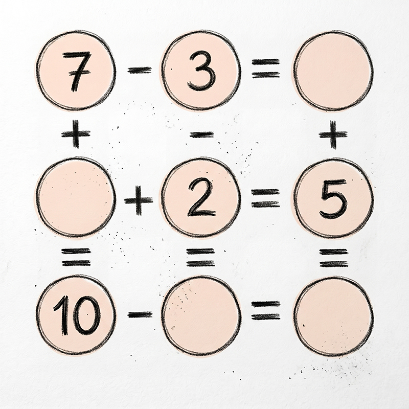
Original Crossmath image ad displayed in Denote, recorded October 22. We inspected the image and caption, not the game's difficulty or user outcomes.
The useful principle is demonstration through a concrete task. The missing spaces introduce a question, and the familiar symbols indicate how to approach it. A product that can demonstrate its value in one frame may be able to use a similarly direct construction.
Do not assume that an unanswered puzzle guarantees engagement or installs. Also check whether the image creates an accurate expectation of the real product.
Original application: show one genuine input, task or product state that the intended viewer can understand. Keep the problem relevant to the product rather than adding an unrelated riddle solely to attract attention.
Choose a layout based on the message
The examples above illustrate two devices. The other options below are production patterns to consider, not additional inspected advertiser case studies.
Choose one main job. A product image, multiple testimonials, a complex comparison and several offers can compete for attention when forced into the same small asset.
How to create static ads from a research reference
1. Write the proposition first
Complete one sentence: “For this viewer, this product is worth considering because…” Keep that argument separate from the headline wording.
If the sentence contains several unrelated benefits, choose the one this creative should explain. A single ad does not have to summarise the whole product.
2. Find image references with a comparable task
In Denote Top Ads, choose an available Game or Tool category, a completed week and the Image format when accessible. For broader research, use Denote Ad Library.
Record the exact scope. Do not label a global Game chart as a US ecommerce sample. A reference from another category can illustrate hierarchy, but its audience and performance cannot be transferred to your campaign.
3. Sketch the hierarchy before polishing
Identify the first thing the viewer should notice, the detail that explains it, and the action that follows. Then remove elements that compete with that sequence.
A simple planning note is enough:
This is a design checklist, not a requirement to put four separate text blocks in every image. The Crossmath reference, for example, lets the visual task do much of the explanatory work.
4. Build with your own assets and truthful claims
Use original product images, gameplay or artwork that you have the right to use. Adapt the relationship between elements rather than copying another advertiser's characters or branded composition.
If you present numbers, time contrasts or testimonials, preserve their context and supporting evidence. The visual should not make a stronger claim than the copy can substantiate.
5. Inspect the actual placement
View the design at the size and crop it will receive. Check small type, the focal subject, essential conditions and the action. Include the surrounding interface in your review when it affects visibility.
A layout that reads well on a large design canvas may lose its evidence or CTA when displayed smaller. Consult the platform's current placement requirements before export; this guide does not prescribe one universal image size.
6. Compare one meaningful change
For an opening or hierarchy comparison, keep the core proposition and destination stable. For an angle comparison, acknowledge that you are testing a different argument.
For example, you might compare a supported progression image with a single-state image using the same progression message. If one version also introduces a new price and audience, the result will be harder to attribute to the layout.
Use your own campaign and business outcomes to decide what to keep. No universal advantage over video is established by the two references in this guide.
Common static ad mistakes
Treating every video thumbnail as an image example. Confirm the source format before documenting a static case.
Replacing evidence with visual polish. A professional comparison or chart does not make the underlying claim true.
Adding text to explain a weak hierarchy. Try simplifying the subject and reading order before adding more copy.
Leaving the destination out of the brief. A clear image can still create the wrong expectation if the next page or game experience does not fulfil its promise.
Judging the format by a competitor's chart position. Discovery signals identify references; your own results evaluate the adaptation.
Start with one image and one clear job
Use Denote's image-ad research view to find a relevant reference, write down its visual mechanism, and sketch an original layout around a claim your product can support. The creative analysis worksheet helps document the evidence; the brief-writing guide helps turn it into a production handoff.
FAQs
Are static ads still useful?
They can communicate a clear product, comparison, offer or task in one frame. Whether that is useful for your campaign depends on the audience, placement, message and results. The examples here do not establish that static ads outperform video.
What is the difference between a static ad and a video thumbnail?
A static ad is delivered as an image creative. A video thumbnail introduces a video. They can look similar in a library, so check the creative-format label.
How much text should a static ad contain?
Use what the task needs and the placement can make readable. Start with one proposition and a clear hierarchy; inspect the rendered result rather than following a universal word count.
Can I use game examples to design an ecommerce ad?
You can study transferable devices such as comparison or demonstration. Build the new creative around your own product evidence and audience, and do not transfer claims about game-ad outcomes to ecommerce.
Method disclosure: this AI-assisted refresh uses recorded Denote image previews. Layout analysis and original application ideas are editorial interpretations, not measured advertiser results.


