3 Facebook Carousel Ad Examples
Facebook carousel ads are the most popular ad format on Instagram and Facebook. They offer a dynamic way to showcase multiple images or videos within a single ad, which can be highly engaging and effective. Dive into some of the best Facebook carousel ad examples to understand how brands attract and convert users.
Nike's Product Showcase
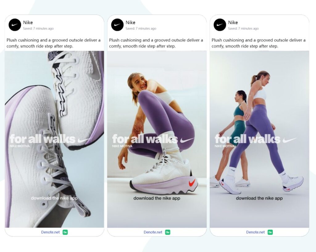
Nike frequently uses Facebook Carousel Ad Examples to display multiple products in a single ad, making it an effective tool for showcasing a range of items and engaging with a broad audience.
- Visual Appeal: The clear product close-ups in Facebook Carousel Ad Examples highlight the shoe’s design and quality, making it easy for consumers to appreciate the details.
- Simple Message: The phrase "for all walks" is concise, conveying that Nike Motiva shoes are versatile for different activities, offering comfort in every step.
- Diverse Models: By featuring models with different body types and styles, Nike emphasizes inclusivity, showing the shoes are for everyone.
- Tone and Emotion: The soft tones and relaxed expressions create a positive, comfortable vibe, reinforcing the product's comfort and support.
Overall, the ad successfully grabs attention while communicating key product benefits, and the use of Facebook Carousel Ad Examples enhances the ability to tell a more complete and compelling story about the product.
Sephora's Beauty Tutorials
Sephora not only engages the audience but also educates them about products, and this is exemplified in their use of Facebook Carousel Ad Examples. These ads allow Sephora to present multiple products or aspects of a single product, making it an effective tool for both engagement and education.
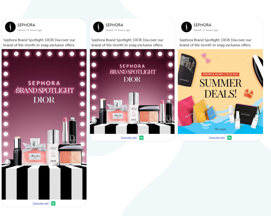
- Brand Collaboration: Featuring Dior as the "Brand Spotlight" in Facebook Carousel Ad Examples draws in luxury product enthusiasts, enhancing the ad's premium appeal. The carousel format enables viewers to swipe through various Dior items, each with its own image and description, deepening the connection with the brand.
- Visual Impact: The elegant product display and glamorous lighting in the Facebook Carousel Ad Examples create a stage or showcase effect, emphasizing the luxury and sophistication of the products. Each slide within the carousel can highlight different angles or features, giving a comprehensive view that captivates the viewer.
- Concise Copy: The message is clear and straightforward, informing consumers about the special brand of the month and exclusive offers, sparking urgency and interest. In Facebook Carousel Ad Examples, concise copy paired with striking visuals ensures that the information is digestible and memorable, driving home the key selling points of the campaign.
- Seasonal Promotion: The inclusion of “Summer Deals” in the Facebook Carousel Ad Examples ties in seasonal discounts, increasing anticipation and encouraging immediate purchases. The carousel allows for a variety of summer-themed promotions to be displayed, each tailored to a specific segment of the audience, maximizing the impact of the seasonal push.
The ad effectively captures attention through premium visuals and brand partnership while clearly conveying its core message, and Facebook Carousel Ad Examples are a prime medium for achieving such a compelling and dynamic advertising experience.
IKEA's Room Inspiration
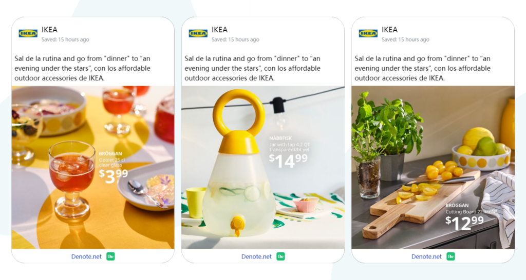
IKEA's Facebook Carousel Ad Examples showcase a range of affordable outdoor accessories designed to help people break the monotony of everyday life, effectively capturing consumer attention through these methods.
- Bright colors: The entire scene in the Facebook Carousel Ad Examples is dominated by yellow hues, creating a warm and sunny atmosphere that aligns with the theme of outdoor activities.
- Simple design: The text in the ad is concise and directly conveys product information and pricing, making it easy for consumers to understand.
- Practical products: The ad showcases several practical outdoor items, such as a water pitcher and cutting board, which are likely to be needed during outdoor activities.
- Lived-in setting: The background depicts a kitchen or patio, providing a relatable living scenario that allows consumers to easily imagine themselves using these products, thereby generating purchase desire.
Overall, IKEA's use of Facebook Carousel Ad Examples is a powerful way to present a cohesive and engaging ad campaign, showcasing a variety of products while maintaining a strong and recognizable brand presence.
Common Characteristics of Facebook Carousel Ad Examples
Studying these best Facebook carousel ad examples reveals several common characteristics that make them successful. These attributes can be used to create effective Facebook carousel ads that attract and convert users.
Engaging Visuals
One of the most striking commonalities among successful Facebook carousel ad examples is the use of engaging visuals. High-quality images or videos are crucial in capturing the user's attention. For instance, Nike's vivid product images and Airbnb's stunning photos draw users in and make them want to learn more.
Compelling Copy
Another essential element found in the best Facebook carousel ad examples is compelling copy. The text accompanying each card should be concise, persuasive, and aligned with the visual content. Sephora's brief and informative tutorial steps are excellent examples of how effective copy can enhance the overall appeal of a carousel ad.
Effective Use of Storytelling
Storytelling is a powerful tool in marketing, and it's no surprise that it's a common characteristic in many top Facebook carousel ad examples. By telling a story through the sequence of cards, brands can create a more engaging and memorable experience for users. IKEA's room inspiration ads effectively use storytelling to guide users through a narrative, making the ads more relatable and compelling.
How to Discover Best Facebook Carousel Ad Examples by Denote?
Discovering the best Facebook carousel ad examples can be a game-changer for your marketing strategy. Denote is the ultimate tool for this purpose, enabling you to uncover and analyze top-performing ads. Here's how you can utilize Denote and other methods to find the best examples.
Utilizing Denote ad Library
Denote ad Library are treasure troves of inspiration and insights. Here's how you can leverage them to discover the best Facebook carousel ad examples.
Use advanced filtering
Denote offers advanced filtering features, allowing you to screen by fields such as Format, Platform, and Category. As you scroll through the page, you can come across many excellent examples. Denote reveals the secrets and strategies behind these creatives, enabling you to learn from the best practices in copywriting, visuals, and more.

Following Industry Leaders
Another great way to discover the best Facebook carousel ad examples is by following industry leaders and influencers. These accounts often share successful ad campaigns and provide valuable insights into what works best. Following brands like Sephora and IKEA can give you a behind-the-scenes look at their ad strategies, allowing you to draw inspiration and apply similar tactics to your own campaigns.
Leveraging Ad Libraries
Ad libraries are excellent resources for finding and analyzing Facebook carousel ad examples. They compile a wide range of ads and offer insights into their performance and strategies.
The Facebook Ad Library is a powerful tool for discovering the best Facebook carousel ad examples. It allows you to search for ads by keyword, advertiser, or even specific campaigns. Understanding the runtime and multiple versions of ads is very important. You can use Denote filters to sort ads by their runtime, view ad spend, and find the competitor ads that are most relevant to your needs. You can find a plethora of successful carousel ads and analyze their components, such as visuals, copy, and overall structure.

Analyzing Competitor Ads
Understanding what your competitors are doing can provide you with a wealth of information and help you stay ahead of the curve. Denote offers a one-click feature to track competitors in the Facebook Ad Library. With just a single click, it automatically scrolls through and saves all of your competitors' ads on the page. Denote will then automatically analyze all of the competitor content and generate a report. This is the most effective way to uncover the secrets of your competitors!
By analyzing competitor ads, you can identify emerging trends in your industry. Look for common themes, visuals, and messaging in their Facebook carousel ad examples. This can help you understand what resonates with your target audience and adapt your strategies accordingly.

Expert Opinions of Facebook Carousel Ad Examples
When it comes to mastering Facebook carousel ads, insights from industry experts can be incredibly valuable. Let's explore what marketing professionals have to say about the best Facebook carousel ad examples and some common mistakes to avoid.
Insights from Marketing Professionals
- Maximize Each Card's Potential
According to Sarah Johnson, a digital marketing strategist, "Each card in a Facebook carousel ad should stand on its own while contributing to the overall message. When you look at successful Facebook carousel ad examples, you'll notice that every card is designed to capture attention and encourage interaction."
- Focus on High-Quality Visuals
"High-quality visuals are non-negotiable," says John Smith, a social media marketing expert. "The best Facebook carousel ad examples always feature sharp, eye-catching images or videos that draw users in. Investing in professional photography or design can make a significant difference."
- Tell a Compelling Story
"Storytelling is a powerful tool," remarks Emily Davis, a content marketing specialist. "Many of the top Facebook carousel ad examples use the sequential format to tell a story that engages users from start to finish. This keeps the audience hooked and more likely to take action."
Common Mistakes to Avoid
Even the best marketers can fall into traps when creating Facebook carousel ads. Here are some common mistakes to avoid, based on expert opinions:
- Inconsistent Visuals
One of the most frequent mistakes is having inconsistent visuals across the carousel cards. "Consistency is key," says Sarah Johnson. "Each card should maintain a cohesive look and feel to create a unified and professional appearance. Inconsistent visuals can confuse users and detract from the overall message."
- Overloading with Information
"Less is more," advises John Smith. "One of the biggest mistakes is overloading each card with too much information. Successful Facebook carousel ad examples keep the message simple and focused, allowing users to quickly grasp the content without feeling overwhelmed."
- Neglecting the Call-to-Action
Failing to include a clear call-to-action (CTA) is a missed opportunity. "Every card should guide the user towards a specific action," emphasizes Emily Davis. "Whether it's 'Shop Now,' 'Learn More,' or 'Sign Up,' a strong CTA is crucial for driving conversions. The best Facebook carousel ad examples always feature prominent and compelling CTAs."
.jpg)
