.jpg)
Why Facebook Post Size Matters
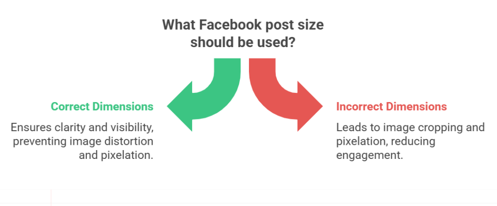
Think of your Facebook post as a tiny billboard on a bustling highway. If the billboard is the wrong shape or the image is fuzzy, drivers (your audience) will glance and drive on. The facebook post size you choose controls whether your creative reads clearly or gets lost in the scroll. Correct dimensions keep faces whole, text legible, and CTAs visible — all of which increase the chance someone stops to look.
Look, it’s not just about making things pretty—getting your image sizes right on Facebook actually saves you from some real headaches. I’m talking about those sneaky little nightmares like Facebook randomly hacking off the best part of your photo, or your crisp design turning into a pixelated mess. You ever seen a gorgeous gradient get turned into a sad Minecraft-looking block? Brutal. Basically, if you stick to the size Facebook wants, your post won’t get butchered, your stuff stays readable, and you don’t end up looking like you made your graphics in 2007 on a potato.
A well-sized image is also a performance booster. On Facebook, visuals are the bait — the clearer and more pleasing the bait, the more likely someone will bite. Optimizing your facebook post size isn’t vanity; it’s conversion hygiene
How size affects reach and engagement
Size influences behavior in ways both obvious and surprising. First, properly sized images maintain visual hierarchy: the subject, headline, and CTA remain in the intended order. When viewers instantly understand a visual, engagement rises. Studies and creative audits repeatedly show that images optimized for their placement get higher click-through rates. The reason: clean visuals reduce cognitive friction. A user doesn’t have to decode your message — they get it at a glance.
Secondly, mobile dominates Facebook usage. A desktop-sized image that looks great on a 24-inch monitor might be a confusing mess on a phone. Using the right facebook post size ensures mobile viewers see a tailored layout rather than a shrunken desktop version.
Finally, engagement is partially a social algorithm problem: Facebook’s systems favor content that gets clicks, shares, and saves. If resizing leads to better visual performance and more immediate clicks, your post is more likely to be shown to additional users — creating a virtuous cycle.
Image compression and algorithm impact
Facebook compresses images to save bandwidth and speed up delivery. Compression can soften details, muddy colors, and introduce banding — especially if you upload an image with the wrong dimensions or a non-standard file type. When you use the recommended facebook post size and high-quality formats (JPEG for photos with quality settings optimized, PNG for sharp graphics), you help the platform preserve your image’s integrity.
Alright, here’s the deal—the algorithm isn’t just peeping at your words, it’s eyeballing your pictures too. If you slap up a crisp, good-looking photo that actually fits the size Facebook wants, boom, suddenly your stuff looks “important” and gets pushed out to more people. On the flip side, post something all pixelated or chopped weirdly? Yeah, the platform’s just gonna ignore it, like, “nah, not today.” Between Facebook squishing your image and its bots judging you silently, nailing the right photo dimensions isn’t just tech geekery—it’s honestly a survival tactic if you want your posts to get seen.
Recommended Facebook Post Sizes
Below are the core sizes to keep in your creative toolbox in 2025. Use them as defaults and tweak when testing:
Feed post — 1200 × 630 px (1.91:1)
This classic landscape format is the go-to for shared links and feed images. It displays well on desktop and mobile and prevents awkward crops. If you create blog thumbnails, event graphics, or link previews, export at 1200 × 630 px to keep proportions steady across placements. For sharper results, use high-resolution files and keep important content within the central “safe” area.
Story post — 1080 × 1920 px (9:16)
Stories live full-screen on mobile. A vertical facebook post size of 1080 × 1920 px fills the canvas without awkward letterboxing. Because stories are viewed quickly, use bold visuals and large text. Ensure critical content sits away from the edges — viewers’ taps and Instagram/Facebook UI elements can cover corners.
Square image — 1080 × 1080 px
Square images are flexible and mobile-friendly. They work for feed posts, carousels, and many ad formats. A 1080 × 1080 px square hits a sweet spot: high enough resolution to stay crisp, compact enough for fast loading. Use square format for product shots, quotes, and consistent grid aesthetics.
Facebook Ad Sizes
When moving from organic posts to paid creatives, sizing becomes even more important. Ads are shown in varied placements — feed, stories, reels, and side columns — so choose dimensions that adapt or produce multiple aspect ratios.
Image ads — 1200 × 628 px
For single-image ads, 1200 × 628 px is a reliable standard. It’s close to the feed dimension but tuned for advertising placements and link previews. Use clean typography, a clear CTA, and keep text minimal to avoid visual clutter. The recommended facebook post size helps ensure your ad appears as intended across placements.
Video ads — 1080 × 1080 or 1080 × 1920 px
Video behaves differently: square (1:1) 1080 × 1080 works well in feeds, balancing screen real estate and compatibility. For immersive vertical experiences — especially in stories and reels — opt for 1080 × 1920 px. Always start with the highest practical resolution and compress carefully; Facebook re-encodes videos, and a good source file preserves detail.
Carousel ads — 1080 × 1080 px
Each card in a carousel benefits from a square layout. Use 1080 × 1080 px images to maintain consistency across cards and avoid uneven cropping. Because carousels tell a story, preserve margins and maintain a visual thread (color, typography, or a repeated visual motif) to keep viewers scrolling.
Design Tips for Better Ad Performance
Good sizing is the foundation; design is the storyteller. Pair dimensions with these practical habits to squeeze the most ROI from your creatives.
Keep text under 20%
Back in the day, Facebook hated when you slapped a bunch of text on your images. Sure, they’ve chilled out a bit, but honestly? Less is still more. Nobody wants to squint at a wall of words on their phone. Think of text like hot sauce—just a sprinkle makes it pop, dump too much and, well, good luck. Drop a punchy headline on your pic, but save the real info for the post itself. Don’t drown your visuals in chatter.
Use high-resolution visuals
Blurry images spell distrust. Starting with high-res files (at least 1080 px on the longest side as a baseline) helps avoid compression damage. When possible, upload images that match the recommended facebook post size to reduce platform re-sampling.
Test post size before publishing
What looks perfect in Photoshop can misbehave on a phone. Preview your creative in both mobile and desktop mockups. Try A/B testing two sizes or crops for the same creative — sometimes a square beats a landscape in CTR. Small experiments yield big learnings.
Facebook Post Size for Ads
How correct dimensions improve CTR
Get your image sizes right, and suddenly your call-to-actions stop playing hide-and-seek. People’s eyes? Total suckers for faces and big, punchy text—like, you could have a neon sign, but if there’s a face, that’s where they’re looking. If your creative doesn’t get squished or chopped, folks actually know what you’re selling, and they might even care enough to click. Ads with the right dimensions? They just work better. No one’s stuck squinting or wondering what’s going on—just see, want, click. It’s not magic, it’s just not making things harder than they need to be.
Mobile vs. desktop ad previews
Mobile is the dominant stage for Facebook. A creative that is visually strong on desktop may lose impact on a narrow mobile viewport. Vertical and square formats often outperform landscape in mobile-first feeds. Always check both previews. If you must prioritize one, go mobile-first: most impressions and conversions now happen on phones.
Tools to Help
You don’t have to resize and test everything by hand. A suite of free and paid tools can automate much of the heavy lifting.
Free AI resizing tools
AI-powered resizers can smartly crop and upscale images while preserving faces and important elements. These tools use content-aware logic to keep people’s heads intact and ensure logos remain legible. Use them when you need quick, good-enough variations for multi-placement campaigns.
Use Denote to analyze top-performing ad creatives
Denote helps marketers spot winning creative patterns by analyzing real ads in the wild. Use Denote to discover what sizes, aspect ratios, and visual motifs drive engagement in your niche. Incorporate those insights into your sizing strategy and iterate faster. (Tip: run a Denote search for competitors’ creatives to see which facebook post size variants appear most in high-performing campaigns.)
Conclusion
Choosing the right facebook post size is more than a design detail — it’s a performance habit. Correct dimensions protect your creative from harsh compression, keep CTAs visible, and make your message accessible across devices. Whether you’re posting a simple link or building a cross-placement ad campaign, adopt the recommended sizes, test aggressively, and let tools like Denote speed up your creative research. When your visuals are crafted to fit the frame perfectly, your content stops being wallpaper and starts earning attention.