
Most advice about Facebook dropshipping ads stops at the format. "Run a UGC video." "Try a carousel." "Use Reels." That advice is not wrong, but it skips the more important question: why does a specific ad work for a specific product at a specific moment in the buying journey?
This guide does not list formats for the sake of it. Each of the 10 examples below is chosen because it activates a different psychological trigger, targets a different funnel stage, and requires a different analytical lens to evaluate. If you are running ads right now, you will recognize the problems each one solves.
We have also tried to be deliberate about what these ads look like from the outside, meaning what signals in the Meta Ad Library or in your own performance data tell you an ad is working before you spend real money testing it.
Read each section as a brief. Not just inspiration, but a working framework you can hand to a creative team or use to analyze what competitors are already running.
Why Most Facebook Dropshipping Ads Fail Before the First Second
The trust gap dropshipping stores face vs. established brands
When someone sees an ad from Nike or Apple, brand recognition does a large share of the trust work before a single word is read. Dropshipping stores do not have that cushion. The moment a user sees an unfamiliar store name, a small part of their brain starts asking questions: Is this real? Will it ship? Is the quality what it looks like?
That skepticism is not irrational. Years of questionable dropshipping ads have trained consumers to be cautious. It means your creative needs to do more than communicate a benefit. It needs to preemptively answer objections, signal legitimacy, and earn attention before it earns the click.
What "converting" actually means for a dropshipping ad
People use the word "converting" loosely. For a dropshipping ad, it is worth being specific. CTR tells you whether the hook worked. Add-to-cart rate tells you whether the product page delivered on what the ad promised. ROAS tells you whether the margin math works. Hold rate, the percentage of viewers who watch past the three-second mark, tells you whether the creative held attention long enough for the message to land.
These metrics do not always move together. A high-CTR ad with a low hold rate usually means the hook was strong but the body of the creative lost people. A high hold rate with low CTR often means the video was interesting but the call to action was weak or unclear. Knowing which number is broken tells you which part of the ad to fix.
The 3 elements every winning dropshipping ad shares: Hook, Proof, Offer
Strip away format differences and nearly every high-converting dropshipping ad contains three things. A hook that stops the scroll in under two seconds, some form of social proof or credibility signal that lowers resistance, and an offer frame that makes the next step feel low-risk. Remove any one of these and the ad almost always underperforms. The 10 examples in this guide each use a different mechanism to deliver all three.
How to Read a Winning Dropshipping Ad Before You Copy It
What to look at first: hook, format, copy structure, CTA
When you find an ad in the Meta Ad Library that looks like it is working, resist the urge to screenshot the visual and move on. A good ad analysis starts with the hook: what is the first thing a viewer sees or hears? Then look at format. Is it a static image, a short-form video, a carousel? Format choice is rarely arbitrary; it usually reflects what stage of the funnel the advertiser is targeting.
Next, read the copy structure. Does it lead with a problem, a benefit, a question, or a number? Where does the offer appear, at the top, the middle, or only at the end? And finally, examine the CTA. The specific language of a call-to-action ("Shop Now" vs. "Learn More" vs. "Get Yours Today") often tells you whether the advertiser is optimizing for clicks, leads, or purchases.
How long an ad has been running: the most underrated signal
The single most useful data point in the Meta Ad Library is the ad start date. An ad that has been running for six weeks or more is almost certainly profitable. Advertisers do not continue spending on creatives that lose money, especially not for extended periods. If a competitor's ad has been active for two months, that is a strong signal the format, hook, and offer combination is working.
Conversely, an ad that launches and disappears in a week is a test that failed. You can learn from those too, but do not copy them. The longevity filter is your first quality screen before you invest time in deeper analysis.
How to use Facebook Ad Library and ad analysis tools to find these ads
The Meta Ad Library is free and accessible to anyone. Search by brand name or keyword, filter by country and ad category, and look for ads with the longest run times in your niche. The limitation is that it shows you what exists, not how it is performing. To get performance signals, you need an ad analysis tool that can layer engagement data, estimated spend, and creative breakdowns on top of what the Library shows.
Tools like Denote's Facebook Ads Analysis Tool let you go a level deeper: analyzing hook type, creative structure, and estimated engagement so you can identify which ad patterns are generating real traction rather than just impressions. The combination of Ad Library data and analytical tools gives you a research workflow that takes minutes, not hours.
10 Facebook Dropshipping Ads That Actually Convert
Each example below is organized around a specific conversion goal and psychological trigger. They are not ranked by effectiveness; different ads serve different stages of the funnel. Use the "how to model this" section in each entry as your creative brief starting point.
Ad #1 The "Silent Demo" Video (No Voiceover, Captions Only)
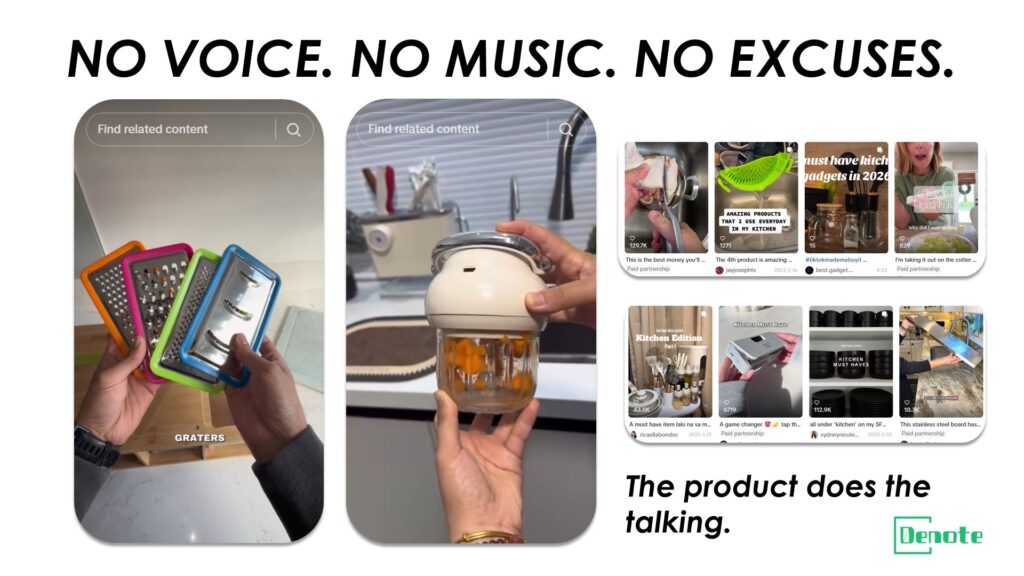
This ad type leads with pure visual action. A hand using a kitchen gadget. A portable charger snapping into place. A stain disappearing from fabric. No narrator. No music that demands attention. Just captions timed to product motion.
It works because over 85 percent of Facebook video is watched without sound. Most video ads are built with audio as the primary communication vehicle, which means the moment autoplay kicks in and the viewer does not tap to unmute, the message is lost. The silent demo flips that assumption. Sound becomes optional, not essential.
Why watch-completion rate determines whether this ad lives or dies
Silent demo ads have a clear failure mode: if the product action is not visually interesting in the first two seconds, viewers scroll immediately. There is no voiceover to buy time, no music to create mood, no presenter to generate curiosity. The product has to carry the entire weight of the hook visually.
This means hold rate is the critical metric for this format, not CTR. An ad with a 70 percent three-second hold rate and a 15 percent CTR is outperforming an ad with a 30 percent hold rate and a 20 percent CTR in almost every scenario. When diagnosing a silent demo that is not working, look at where viewers drop off in the video first.
The caption rhythm and product motion sync formula
The most effective silent demos follow a tight rhythm: one new visual event every two to three seconds, with a caption that names or reinforces what just happened. The caption does not need to be clever. "Removes 3 layers of dead skin. In 60 seconds." is more effective than a tagline. Think of captions as the narration a viewer would provide themselves if they were watching someone use the product in a store.
Cut on action, not on silence. Every edit should follow a moment of visible product movement. Zoom-in cuts that reveal a detail, top-to-bottom reveal shots, and before/during/after cuts all maintain attention better than static product shots held too long.
Which product categories perform best with sound-off storytelling
Kitchen tools, personal care devices, home organization products, and anything with a visible transformation process are the natural fits. What these categories share is that the value proposition can be demonstrated without words. You can show a drawer organizer going from chaos to order in eight seconds. You can show a lint roller working on a pet-hair-covered couch in five seconds. The product sells the product.
Where this format struggles: products that require explanation. Supplements, digital services, and anything where the benefit is intangible or delayed do not translate well into a purely visual format. For those categories, one of the later ad types in this guide will serve better.
How to check the Ad Library to see if a silent demo is gaining real traction
In the Meta Ad Library, look for silent demo ads that have been running for more than three weeks in your category. Longevity is the proxy for performance here. Then look at whether the brand is running multiple variations of the same format. If you see four or five iterations of what is essentially the same silent demo with slightly different opening shots, that is a brand testing into a winning creative direction. That level of iteration investment only happens when a format is delivering results worth optimizing.
Ad #2 The Founder / Backstory Ad (First-Person Cold Traffic)
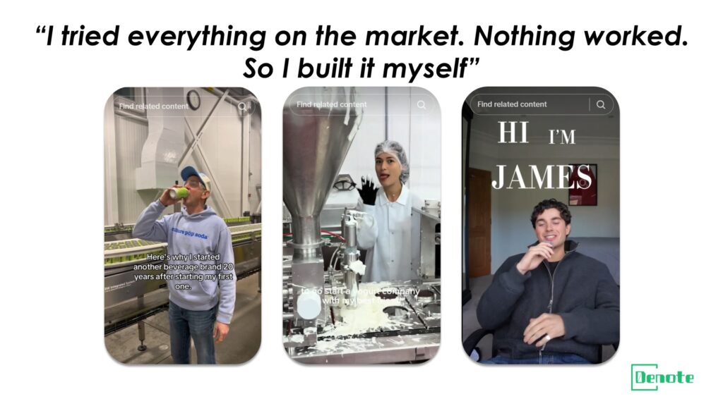
This format opens with a person, usually the brand founder or a brand persona, speaking directly to the camera about why they created the product. Not a sales pitch. A story. Something like: "I spent two years trying every posture brace on the market. None of them worked. So I spent eight months building one that actually did."
It works because it answers the question consumers have about every dropshipping brand: who made this, and why should I trust them? The backstory ad short-circuits that skepticism by making the brand feel human before asking for any commercial commitment.
"Why I built this" outperforms feature lists for cold traffic
Cold audiences have no prior relationship with your brand. Feature-based ads, even excellent ones, require the viewer to already believe the brand is credible enough to evaluate the features accurately. A backstory ad builds that credibility first, so that by the time the product is introduced, the viewer is already emotionally invested.
The psychology here is borrowed from how people buy from local businesses. You walk into a family bakery and learn it was started by a grandmother with her original recipe, and that story changes how the croissant tastes. The product has not changed. The context has. Backstory ads do the same thing for products sold online by unfamiliar brands.
The script structure: honest flaw, pivot moment, product as solution
The most effective backstory ads follow a three-beat structure. Beat one: establish a relatable, specific problem the founder personally experienced. The more specific the better; generic pain points ("I was tired of bad products") do not build credibility. Beat two: the pivot moment, usually a realization or discovery that led to building the product. Beat three: the product introduction, framed not as a sale but as the conclusion of the story.
Notice that the offer does not appear until the end. This is intentional. Lead with story, earn attention, then transition to the commercial. Ads that reverse this order, offer first, story later, tend to lose viewers before the trust has been established.
How to execute this format without showing your face on camera
Face-to-camera is the most effective execution, but it is not the only one. Voiceover with B-roll footage of the product being developed or used, text-on-screen in first person, and even a series of static images with first-person copy can carry the backstory structure. The key variable is not the medium; it is whether the narrative feels personal and specific rather than manufactured.
If you are working with a supplier product rather than something you developed personally, the backstory can be adapted: "I've been sourcing this category for three years, and the product I kept coming back to is this one. Here's why." Honesty about the business model, handled well, can actually increase trust rather than undermine it.
How long this ad format typically runs, and when to refresh it
Backstory ads tend to have longer creative lifespans than most dropshipping formats, often six to twelve weeks before fatigue sets in, because the story itself creates an emotional anchor that does not stale as quickly as a hook built purely around a feature or discount. The warning sign is when CTR stays high but conversion rate begins to decline, which usually indicates the audience has seen the ad enough times that the story no longer feels new. At that point, a variant with a different opening beat, same story, different entry point, typically extends the runway another four to six weeks.
Ad #3 The "Objection Killer" Static Image
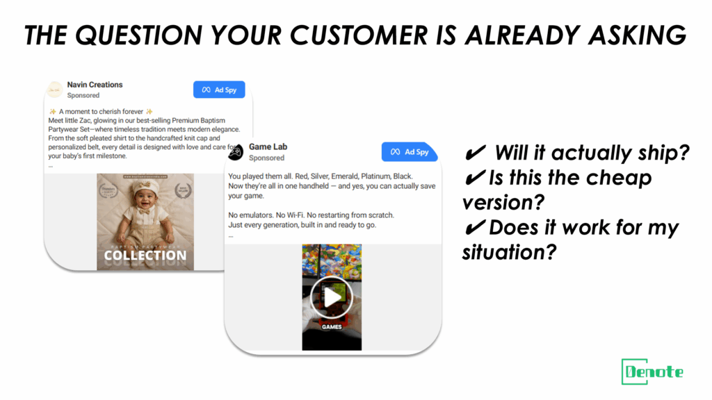
This is a static image ad, often a clean graphic with a comparison grid or a bold headline that names the exact objection a potential customer is most likely to have. Examples: "Yes, it actually ships from the US." "No, this is not the cheap version you've seen on TikTok." "Yes, it works on coarse hair too."
It works because most dropshipping conversion failures happen not at the ad level, but in the mental conversation a user has with themselves after seeing an ad they were interested in. The objection killer intercepts that conversation before it sends the user to a competitor.
Writing the headline around what your customer already believes is wrong
Effective objection killer ads require knowing your specific friction points, not generic ones. The fastest way to find them is to read your negative reviews, look at what questions are asked most frequently in comment sections of competitors' ads, and pay attention to abandoned cart patterns on your store. The objection that causes the most drop-off is the one worth putting in the headline of this ad.
The structure is simple: name the objection in the headline, answer it immediately in the subheadline or visual, and reinforce the answer with a proof element such as a review snippet, a shipping guarantee badge, or a before/after comparison. Keep the design clean. Complexity undermines credibility in this format.
The three-column comparison layout logic
A particularly effective visual execution of the objection killer is a three-column grid: Your Product | Competitor Category | DIY Alternative. Each row in the grid covers a dimension the customer cares about: price, quality, ease of use, speed, longevity. The goal is not to attack competitors by name but to make the value differentiation visible at a glance without requiring the viewer to do any analysis themselves.
This format performs strongly in right-column placements and Marketplace listings where static images dominate, because the grid structure communicates density of information efficiently in a format where video autoplay is less prominent.
Why static images outperform video in specific placements for this format
Right-column ads, Marketplace, and Facebook Search results all favor static images for a structural reason: the viewing context. In these placements, the user is in a browsing or searching state, not a scrolling state. They are slightly more willing to look at a single image and read accompanying text. Video autoplay in these placements generates less attention because the viewer is already engaged in an active task. The objection killer static takes advantage of that browsing state by delivering a clear, scannable answer to the question the viewer is already implicitly asking.
Using an ad analysis tool to find which objections competitors are already addressing
Before writing your objection killer ad, run a search in your ad analysis tool for the top-performing static image ads in your niche. Look for patterns in headline language. If three of your competitors' long-running ads all address shipping speed in the headline, that is a strong signal shipping anxiety is the primary objection in your category. If multiple ads feature money-back guarantee language prominently, that signals purchase risk is the dominant friction point. Use that data to prioritize which objection to lead with.
Ad #4 The Advertorial-Style Long Copy Ad
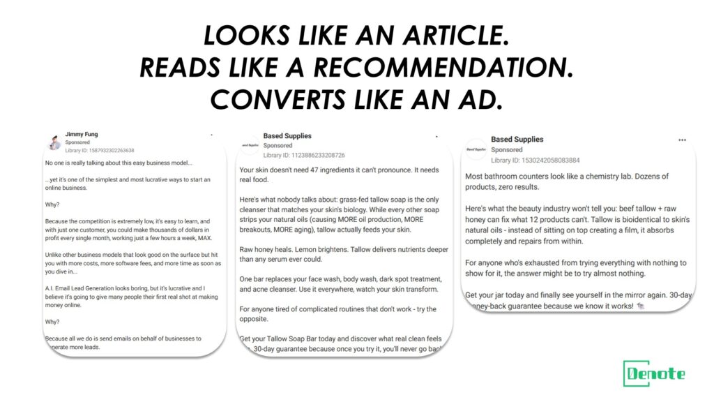
This is a Facebook post-style ad with a large block of text formatted to look like a personal recommendation or editorial article rather than a commercial. It typically begins with a first-person anecdote or a headline written in the style of a news article: "I Replaced My Entire Morning Routine With This One Product. Here's What Happened."
It works because it bypasses the visual pattern recognition that causes users to skip ads. When the opening looks like a friend's update or a news story, the brain does not immediately categorize it as advertising. By the time the product is mentioned, the reader is already invested in the narrative.
Why long copy converts for higher-ticket dropshipping products
Short-form ads are optimized for impulse. For products priced above forty or fifty dollars, impulse is less reliable as the primary conversion mechanism. Buyers at that price point want more information, more reassurance, and more context before committing. Long copy provides all three without sending the user to a landing page where they might get distracted.
The advertorial format is particularly effective when the product category involves some skepticism: health and wellness products, posture correctors, sleep aids, and anything that makes a claim requiring verification. The long-form structure signals seriousness and gives the brand room to pre-answer the questions a skeptical buyer would have.
Writing with a news-article tone: headline, personal narrative, product reveal
The lead paragraph should read like something a journalist or a thoughtful blogger would write, not like a product description. Specific details make it credible: dates, before-and-after measurements, names of things that did not work before. Vague claims ("I felt so much better") are less convincing than specific ones ("After three weeks, I stopped waking up at 3am").
The product reveal should come after the story has built investment, roughly halfway through. Once introduced, the product should be described in terms of what it did, not what it is. Features belong in a product listing. In an advertorial ad, benefits delivered through a personal experience are the unit of information.
Which landing page type works best with advertorial ads
Sending an advertorial ad to a standard product detail page creates a significant tonal mismatch. The user has just read what felt like a personal recommendation and arrives at a page that looks like an e-commerce store. The friction is real. Advertorial ads convert better when the landing page continues the narrative, either with an extended story-format advertorial page or a long-form product page that leads with a testimonial structure rather than a feature grid.
How to tell if a competitor is running long copy ads at scale
In the Meta Ad Library, long copy ads show up with truncated text followed by a "See More" link in the preview. If you see a competitor running multiple variants of ads with that truncation pattern over an extended period, they are likely running an advertorial approach at meaningful scale. The iteration count tells you whether it is working: three or more variations of the same long-copy format from the same brand is a strong performance signal.
Ad #5 The "Real Customer Journey" Before/After Static
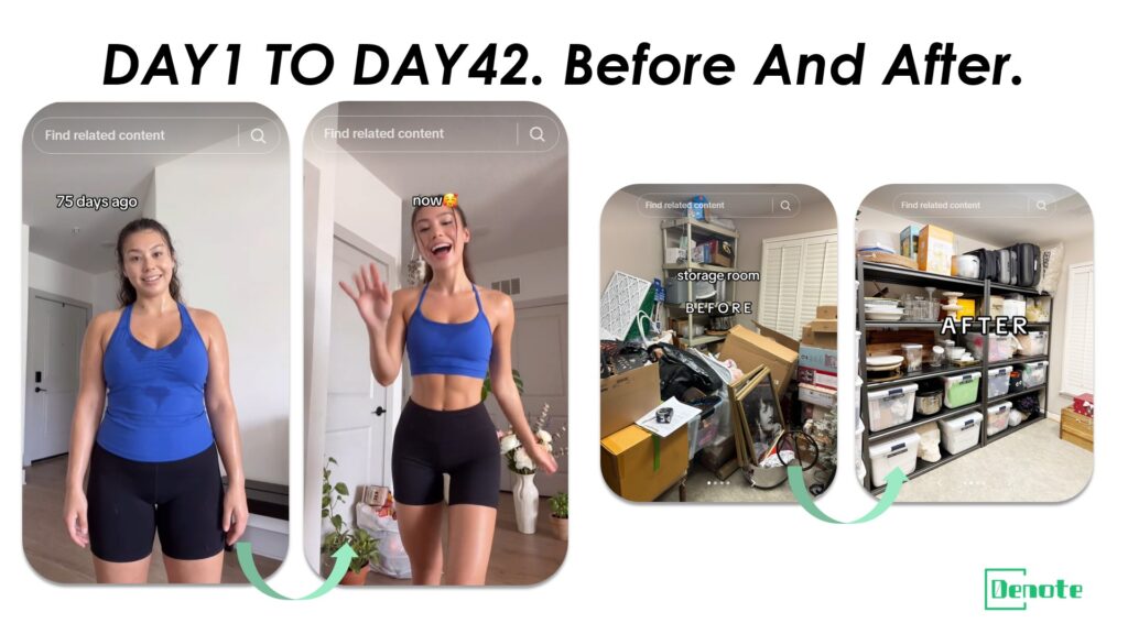
This is a static image ad organized around a timeline: a visible before state on the left, an after state on the right, with a bridge element in the middle that attributes the change to the product. Unlike a generic benefit visual, the real customer journey version includes authentic markers of authenticity: imperfect photography, a real timeframe ("after 6 weeks"), and copy written in the customer's own voice rather than marketing language.
The key distinction from a standard before/after is the time dimension. Showing a product on day one and day forty-two implies sustained use and real results. That temporal specificity is far more convincing than an instant transformation, which often reads as artificially staged.
Why "before/after" and "problem/solution" are not the same persuasion mechanism
Problem/solution ads show a state and its resolution simultaneously. They are fast and effective for cold traffic because the logic is immediate. Before/after ads show a state, a passage of time, and a different state. They are more effective for audiences that have already considered the product but need reinforcement that results are realistic and sustainable.
This distinction matters for targeting. Problem/solution ads belong at the top of the funnel, reaching new audiences who do not yet know the product. Real customer journey before/after ads perform better in retargeting pools, reaching people who have visited the product page, watched a prior video, or engaged with a previous ad. The emotional trigger in the former is recognition; in the latter, it is reassurance.
Staying compliant: what Meta's ad policies allow and prohibit in this format
Meta's advertising policies have specific restrictions on before/after content in health and body-related categories. Claims that imply significant physical transformation, particularly for weight loss, skin conditions, or medical outcomes, require substantiation and may be outright prohibited depending on the claim type. The safest path is to focus on functional changes (a cleaner home, a more organized space, a more comfortable sleeping position) rather than physiological ones, and to use real customer photography rather than stock imagery or edited visuals.
For categories where before/after is permissible, the copy should be accurate and specific. "From constant back pain to my first 8-hour sleep in two years. It's not a miracle, it's just the right support." That framing is honest, specific, and compliant, and it is also more persuasive than a superlative claim.
Image layout ratios: which side gets more visual space and why
The after state should occupy more of the frame than the before state. This is counterintuitive for some advertisers who default to a 50/50 split, but the visual weight should land on the outcome, not the problem. A 40/60 or 35/65 before/after split, with the after side larger and brighter, directs the eye where the emotional payoff is and leaves the viewer with a visual memory of the desired outcome rather than the pain state.
Using Denote to analyze competitors' before/after ad run times
Before investing in before/after creative production, use Denote to look at how long competitors' before/after static ads have been running versus their other formats. In categories where this format performs well, you will typically see longer run times for before/after statics compared to video ads from the same brand. That relative longevity within a single brand's creative mix is a stronger signal than absolute run time alone, because it controls for the brand's overall ad cadence and budget level.
Ad #6 The "3-Reason Why" Benefit Stack Video
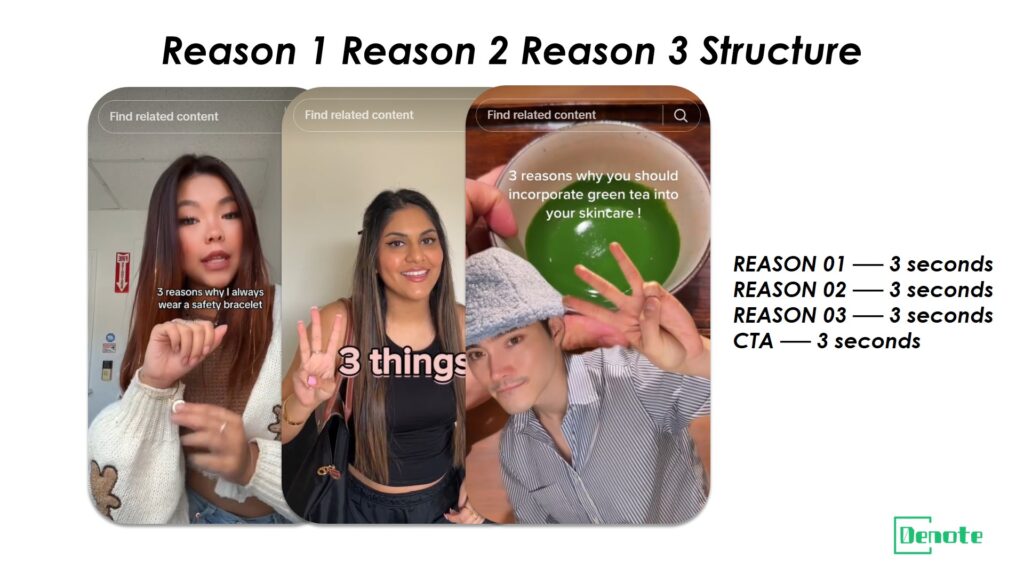
This format structures the entire ad around three distinct reasons to buy, each delivered in a tight window of approximately three seconds per reason. The visual and copy are in lockstep: as each reason appears on screen in text, the video shows the product delivering that specific benefit. No filler. No lifestyle padding. Three reasons, nine seconds of content, one clear CTA.
It works because it respects the viewer's time explicitly. The structure signals immediately that this ad has a defined length and a clear purpose. That implicit contract, "I will give you three reasons and then stop," reduces scroll resistance because it removes uncertainty about how long the ad will go.
Why building perceived value through reasons outperforms leading with discounts
Discount-led ads are effective but expensive. Every time a brand leads with a percentage off, it is teaching its audience to expect discounts before purchasing, which creates a customer base that will never buy at full price and a brand that is perpetually in sale mode. Benefit stack ads build perceived value at full price. When the offer comes at the end, it lands as a reward for a product that already seemed worth full price, not as the primary reason to buy.
This matters especially for dropshipping stores trying to build repeat customers or scale beyond a single winning product. A customer acquired on the value of the product will return. A customer acquired purely on a discount will return only when there is another discount.
The three-second rule for each benefit: pacing and information density
Three seconds is enough time to state a benefit clearly and show it happening on screen. It is not enough time to explain, qualify, or add context. Each of the three reasons in this format needs to be ruthlessly simple: one sentence, maximum eight words, paired with unambiguous product footage. "Works on any fabric type" with footage of the product on silk, denim, and wool. That is a complete three-second benefit segment.
The common failure mode is trying to fit more information into each segment, which causes the ad to feel rushed without adding persuasion. If a benefit requires more than three seconds to communicate, it belongs in a different format, not this one.
Text animation vs. real presenter: performance comparison by audience temperature
Text animation, meaning on-screen kinetic text without a face on camera, performs better for cold audiences at the top of funnel. It processes faster visually and does not require any parasocial relationship with a presenter. Real presenter delivery performs better in warm retargeting audiences because the face creates a continuity effect: if a viewer has seen the presenter before in a prior ad, the familiarity accelerates trust.
This suggests a simple sequencing strategy: launch the text animation version for cold traffic acquisition, then introduce a presenter-delivered version of the same three-reason structure for retargeting. Same message, different delivery mechanism, calibrated to audience temperature.
Feed vs. Reels placement performance differences for this format
In Feed, the benefit stack video competes with organic posts, which tend to be longer and more narrative. A nine-second structured ad often outperforms longer ads in Feed because the brevity is distinctive in a context of longer content. In Reels, the format competes with short-form entertainment content where pacing expectations are higher. For Reels, the three-second segments need to be slightly faster in edit pace, with sharper cuts and more visual movement to match the ambient energy of the placement.
Ad #7 The Comment-Bait Engagement Ad
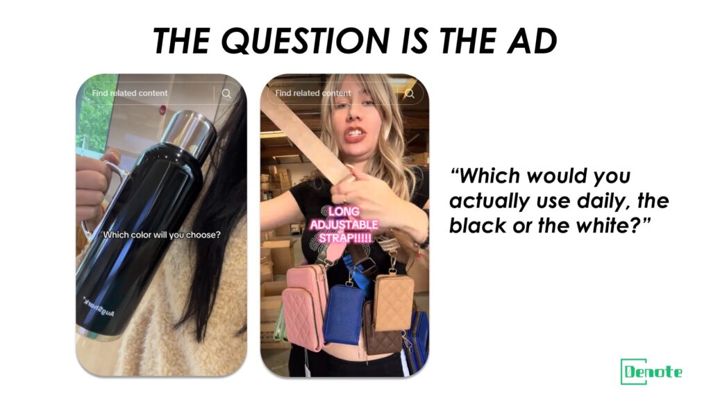
This format is designed to generate comments as its primary engagement metric. It typically poses a question or presents a choice that is genuinely interesting to the target audience: "Which one would you actually use daily: the black or the white?" or "Drop your city in the comments and we'll tell you your shipping time." The product is present but secondary to the interactive mechanic.
It works because Facebook's algorithm weighs comment engagement heavily in organic distribution signals. An ad that generates a large volume of comments gets extended reach at lower effective cost because the engagement improves its quality score in the delivery system. The comments also serve as social proof for subsequent viewers, particularly when they are positive or enthusiastic.
Using "A or B" mechanics to lower ad resistance before the sell
The reason comment-bait ads lower resistance is structural. A direct "Buy Now" ad immediately signals commercial intent, which triggers the mental filter most users apply to advertising. An ad that leads with a question or a choice asks for an opinion first, not a wallet. That sequence, engagement before offer, mirrors the natural progression of a conversation rather than a transaction.
The most effective comment-bait questions are ones where the answer is genuinely relevant to the product choice the viewer would need to make anyway. "Which size would you get for a small apartment?" is both an engagement mechanic and a pre-qualification question. By answering it, the viewer has already mentally placed themselves in the scenario of owning the product.
How comment volume feeds back into ad delivery efficiency
When a comment-bait ad begins generating organic conversation in the comment section, the effective CPM drops because the algorithm treats it as higher-quality inventory. Each comment also appears in the commenter's friends' feeds as an activity update, creating secondary organic distribution that costs nothing. This flywheel effect means the early comment volume on a comment-bait ad is a leading indicator of its eventual reach efficiency.
The practical implication: seed the comment section early. The first twelve hours of a comment-bait ad's life are critical. If the team can drop a few genuine responses to comments in the early hours, it creates social momentum that makes subsequent organic commenters more likely to engage.
Staying on the right side of Meta's engagement-baiting policies
Meta explicitly prohibits "engagement bait," defined as content that artificially solicits reactions, comments, shares, or tags. There is a meaningful distinction between a post that says "Tag a friend who needs this" (prohibited) and one that asks a genuine product-relevant question (permitted). The comment-bait ad format lives in the permitted zone as long as the question is authentic and directly relevant to the product rather than a transparent attempt to game distribution.
Avoid phrases that directly solicit shares or tags. Focus questions on preferences, experiences, or choices related to the product category. That framing passes policy review and still generates the comment volume that drives delivery efficiency.
Ad #8 The Listicle Hook Ad ("5 Signs You Need This")
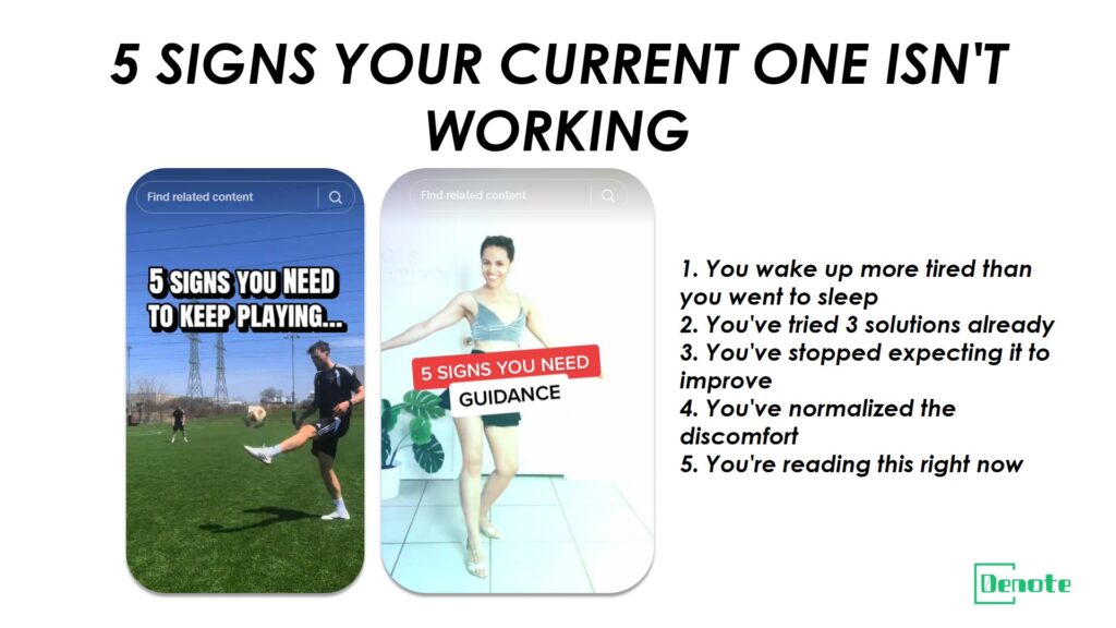
This format opens with a numbered list premise in the first line of copy or the first frame of video: "5 signs your current one is the wrong fit." "4 things people who sleep through the night have in common." The structure triggers a completion instinct; once a viewer sees a numbered list opening, a part of their brain wants to read through all the items.
It works because listicles are the native content format of social media. Users are conditioned to process numbered lists efficiently. When an ad opens in that format, it processes as content before it processes as advertising, buying the creative approximately two additional seconds of attention before the commercial nature of the message becomes apparent.
Why self-diagnosis copy converts better than benefit promises
A listicle hook that helps viewers diagnose their own problem converts better than one that simply promises a solution because the viewer does the persuasion work themselves. When someone reads "3. You wake up more tired than when you went to sleep" and recognizes their own experience, they have identified their own pain point. The product does not need to convince them the problem is real; they have already confirmed it.
This is a subtly different persuasion mechanism from benefit-first ads. Benefit ads tell the viewer what they will gain. Listicle hook ads help the viewer discover what they are currently losing. The emotional direction is different, and for many product categories, loss framing is more motivating than gain framing, particularly when the loss involves daily discomfort or inefficiency that the viewer has normalized.
Script structure: symptom list, emotional moment, product as exit
The listicle script follows a clear three-part structure. First, the symptom list, delivered quickly, one item every two to three seconds, with each symptom phrased in second person ("You wake up at 3am." "You've tried three different solutions." "You've stopped expecting it to get better."). Second, a brief emotional acknowledgment that validates the frustration without dwelling in it. Third, the product introduction framed as the exit from the symptom pattern, not as a general benefit but as the specific resolution to the symptoms just named.
The specificity of the symptoms in part one determines the conversion rate. Generic symptoms ("You don't feel your best") generate curiosity but not urgency. Specific symptoms ("You've tried elevating your head with four pillows and it still didn't work") generate recognition and urgency together.
Walk-and-talk shooting style and why it works for this format on mobile
The listicle format pairs particularly well with a walk-and-talk shooting style: the presenter walking through a space while delivering the symptom list to camera, shot in vertical format on a phone. This style feels native to mobile viewing, mirrors the aesthetic of short-form personal content, and maintains attention through movement even when the copy is the primary vehicle of information.
The production cost is low, which means iteration is fast. If one version of the symptom list does not perform, a new version with different symptoms can be filmed and launched within hours. That iteration speed is a structural advantage for a format where the specific language of each symptom can significantly change conversion rates.
Conversion pattern in female-skewing consumer categories
Listicle hook ads consistently overperform benchmark CTRs in female-skewing consumer categories: skincare, home organization, wellness, and sleep products. The pattern holds across different price points and creative production levels. The working hypothesis is that the self-diagnosis structure aligns well with the research behavior patterns more common in these categories, where buyers tend to gather more information before purchasing and are more receptive to content that validates their existing experience before introducing a solution.
Ad #9 The "Proof Snapshot" Screenshot Ad
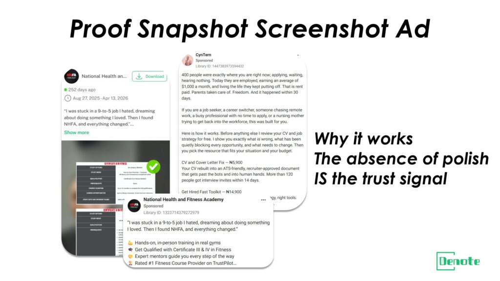
This format uses real, unedited-looking screenshots as the primary visual element: Shopify order notifications, Trustpilot reviews, DM conversations with customers, or photos submitted by buyers. The aesthetic is deliberately low-production. It looks like something a person would share in a message or a story, not something a marketing team designed.
It works because it is visually distinctive in a feed dominated by polished creative. More importantly, it signals authenticity through aesthetic honesty. A screenshot of a real order confirmation or a raw customer photo carries a credibility that a designed graphic cannot replicate because it is not designed. The absence of production value is itself a trust signal.
Why "ugly ads" sometimes out-click polished creative on CTR
There is a well-documented phenomenon in performance marketing where deliberately rough, unpolished creatives outperform professionally designed ones on CTR, particularly for cold traffic. The mechanism is attention contrast: in a feed where most ads look like ads, something that looks like organic content stops the scroll precisely because it does not pattern-match to advertising.
The proof snapshot ad is one of the most reliable executions of this principle because the visual authenticity of the screenshot provides the contrast while also delivering a substantive trust signal. It is not rough for the sake of roughness; it is rough because real screenshots are rough, and real screenshots from real customers are inherently more convincing than anything a design team could produce.
Compliance boundaries: what screenshot content Meta will and will not allow
Meta's ad policies have specific restrictions on income claims, health outcomes, and before/after comparisons. Screenshots showing Shopify revenue dashboards can trigger income claim policy violations if the implication is that viewers could replicate those results by purchasing the product. Screenshots of customer reviews are generally compliant as long as they do not make prohibited health claims or exaggerated performance promises.
The safest screenshot content for this format: genuine customer photos submitted with permission, Trustpilot or Google Review extracts that focus on experience rather than outcome claims, and shipping confirmation imagery that signals order volume without making financial claims. When in doubt, screenshot the customer experience rather than the business performance.
Frequency and audience overlap: when screenshot ads start losing effectiveness
Because proof snapshot ads rely heavily on the novelty of their aesthetic, they are more susceptible to creative fatigue when shown to the same audience repeatedly. An audience that has seen the same Trustpilot screenshot four times has already processed the credibility signal it was designed to deliver. Monitoring frequency metrics in your ad account is important: once a screenshot ad hits a frequency above three for a given audience segment, begin rotating to new screenshots or a different format.
Ad analysis tools like Denote can help you identify which audience segments your proof snapshot ads are reaching most frequently, so you can make rotation decisions before performance declines rather than after. Proactive rotation based on frequency data adds weeks to the effective lifespan of this format.
Ad #10 The "How It Works in 30 Seconds" Explainer with Embedded Hook
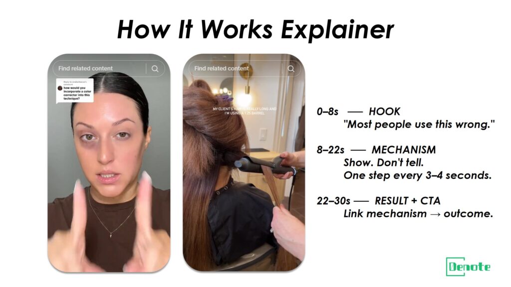
This format answers the question a curious but unconvinced buyer is already asking: how does this actually work? It is a thirty-second video that walks through the product's mechanism of action in real time, with a presenter or voiceover narrating the steps while the product is being used on screen. The key distinction from a standard product demo is the embedded hook: the explainer opens with a pattern-interrupting claim or question that makes the mechanism itself sound interesting before it is revealed.
Where other explainer formats, including animated motion graphics, use illustration to simplify, this format uses real product interaction because tactile reality is more persuasive than animation for categories where buyers are skeptical about whether the product works as described.
The critical difference between this and animated explainer ads
Animated explainer ads are excellent for explaining abstract products: software, financial tools, subscription services, anything where the core value cannot be shown physically. For physical dropshipping products, animation introduces a layer of abstraction that can actually increase skepticism rather than reduce it. "If this product worked as well as the cartoon suggests, why aren't they showing me the real thing?" is the implicit question.
The thirty-second real-product explainer answers that question preemptively by making the mechanism visible in the physical world. A person using the product, showing the specific motion, the specific result, the specific amount of time it takes, delivers information that an animation cannot credibly provide.
Products that benefit most from mechanism-based advertising
Products in categories where the value proposition requires some education are the strongest candidates for this format. Posture and ergonomic products, cooking tools with non-obvious applications, skincare devices, cleaning tools with unusual mechanisms, and anything in a category where the buyer's primary question is "but how does it actually work?" benefit most from an explainer format.
The counterindicator: products where the mechanism is obvious and the value proposition is immediately visible do not need thirty seconds of explanation. A lint roller does not need an explainer. A sonic facial cleansing device probably does. Complexity of mechanism is the primary selection criterion.
Information density within a 30-second window: the three-act structure
The most effective thirty-second explainers follow a three-act structure within the time constraint. Act one, seconds zero to eight: the embedded hook, typically a surprising claim about what the product can do or a question that makes the mechanism sound counterintuitive. Act two, seconds eight to twenty-two: the mechanism walkthrough, showing the product in use with narration that explains each step without technical language. Act three, seconds twenty-two to thirty: the result and the call to action, linking the mechanism back to the outcome the buyer cares about and giving them a clear next step.
Resist the urge to pack more information into the thirty seconds. Every second of explanation that goes beyond what is necessary to make the mechanism believable is a second that is not converting. Clarity is more valuable than comprehensiveness in this format.
Using hold rate as a creative quality indicator for explainer ads
Hold rate, the percentage of viewers who watch to a defined completion point, is the most informative performance metric for this format. A thirty-second explainer with a strong three-second hook but a weak mechanism reveal will typically show a sharp drop-off around the eight-second mark, precisely when act one ends and the actual explanation begins. That drop-off pattern is diagnostic: it tells you the hook was effective but the mechanism explanation lost people.
Conversely, an explainer with a weak hook but a compelling mechanism reveal will show gradual, steady viewership rather than a cliff at eight seconds. That pattern indicates the hook needs work, not the mechanism. Using hold rate data to isolate which part of the thirty-second window is underperforming allows you to make targeted edits rather than remaking the entire creative.
What These 10 Ads Have in Common: The Pattern Behind What Converts
Hook types that consistently appear in high-performing dropshipping ads
Looking across all ten formats, three hook mechanisms appear repeatedly. Curiosity-gap hooks: statements that imply the viewer is missing information and frame the rest of the ad as the revelation. Self-identification hooks: content that mirrors the viewer's own experience so accurately that they feel directly addressed. Counterintuitive claim hooks: openings that challenge a belief the viewer already holds, generating enough cognitive dissonance to demand resolution.
Free-shipping hooks and generic discount hooks are conspicuously absent from long-running, high-performing ads. They work for short-term conversion spikes but do not sustain because they attract buyers whose primary loyalty is to the discount, not to the product.
Offer framing in 2026: why "free shipping" alone does not close the deal anymore
In 2026, free shipping is a baseline expectation, not a differentiator. Buyers have been conditioned by years of e-commerce to expect it as a given. Leading with it as a primary offer signal communicates either that the product has no other compelling reason to buy, or that the brand is unaware of what contemporary buyers actually respond to.
The offer frames that are working now are risk reduction offers (free returns, money-back guarantees), exclusive access offers (early access to new colorways, limited stock signals), and bundled value offers that change the perceived price-to-value ratio without leading with a discount percentage. Each of these works because it addresses the actual hesitations contemporary buyers have rather than offering a concession that no longer differentiates.
The copy length that performs best for dropshipping ads in 2026
There is no single optimal copy length across all formats and funnel stages. For cold traffic, shorter primary text, under sixty words, combined with a strong visual hook outperforms long primary text because the visual is doing most of the persuasive work. For retargeting audiences who have already seen the product, longer primary text that pre-answers objections or provides additional social proof begins to outperform short copy because those viewers already have enough brand familiarity to read.
The practical rule: the colder the audience, the shorter the copy. The warmer the audience, the more copy is warranted. Using the same copy length across all audience temperatures is one of the most common structural errors in dropshipping ad accounts.
Creative fatigue signals: how to know when to refresh before performance drops
Waiting for ROAS to decline before refreshing creative is expensive. By the time the decline is visible in the data, the audience has already been over-exposed and competitive advertisers have had time to capture the attention your fatigued creative was missing.
Earlier warning signals: frequency rising above 3.0 for any audience segment, CTR declining while CPM holds steady, an increase in negative feedback rates (hide ad, not relevant), and comment sentiment shifting from positive to neutral or dismissive. Any one of these signals warrants beginning creative development. All four together mean you are already behind the curve.
How to Find and Analyze Winning Dropshipping Ads Before You Spend a Dollar
Step 1 Filter the Meta Ad Library for longevity, not just existence
Most people search the Meta Ad Library for ideas and stop there. The more productive use is to filter for longevity. Any ad that has been running for six weeks or more in your category has passed the most important test: a real advertiser with real budget kept it alive. That is your starting set.
Search for category keywords, not just brand names. Look at the start date column. Sort mentally or manually for the oldest active ads. Those are your research subjects, not the newest or the most visually polished.
Step 2 Use an ad analysis tool to decode hook type, format, and offer structure
Once you have a set of long-running ads identified, bring them into an analysis layer. Denote's Facebook Ads Analysis Tool lets you analyze the structural components of competitor ads: what kind of hook they are using, how the copy is structured, where the offer appears, and what format and placement the ad is optimized for. This turns a collection of screenshots into a structured dataset.
Look for patterns across multiple ads from the same brand and across brands in the same category. When three different advertisers are independently running the same hook type, that convergence is a market signal, not a coincidence.
Step 3 Build a swipe file organized by funnel stage, not by format
Most swipe files are organized by format: "video ads," "carousel ads," "static ads." That organization is useful for production reference but not for strategic planning. A more useful organization is by funnel stage: cold traffic awareness ads, warm traffic consideration ads, retargeting conversion ads. Within each stage, collect examples organized by the psychological mechanism they use.
This way, when you are planning a campaign for a new product, you can go to the relevant funnel stage of your swipe file and find examples of what is working for audiences at that level of awareness, rather than defaulting to whatever format you used last time.
Step 4 Test one variable at a time against a proven baseline
The fastest way to waste ad budget is to test multiple variables simultaneously. If you launch a new hook, a new format, and a new offer in the same creative, and performance improves, you do not know which change drove the improvement. If performance declines, you do not know which change caused the problem.
Start with a proven baseline creative, something that has already performed above category average. Test one change against that baseline: a different hook, the same copy in a different format, the same visual with different offer framing. That discipline of single-variable testing takes patience but produces knowledge that compounds, because each test result tells you something specific about what your audience responds to.
FAQ: Facebook Dropshipping Ads in 2026
How much should I spend on Facebook ads for dropshipping?
There is no universal answer, but a useful framework: budget enough to generate at least fifty purchase events per ad set per week before making optimization decisions. Below that threshold, the data is statistically unreliable and algorithm optimization is ineffective. For most dropshipping products priced between twenty-five and seventy-five dollars, that typically means a daily budget of thirty to seventy dollars per ad set during the testing phase.
Start with three to five ad sets testing different audiences or creative angles at that daily budget. Once one ad set demonstrates consistent ROAS above your target, begin scaling it incrementally, increasing budget by no more than twenty to thirty percent every two to three days to avoid resetting the algorithm's learning phase.
What ad format works best for a brand-new dropshipping store?
For a new store with no pixel data and no warm audiences, start with short-form video on cold traffic audiences. The UGC-adjacent formats such as the silent demo (Ad #1) and the founder backstory (Ad #2) tend to perform well for new stores because they build trust without requiring any prior brand familiarity. Avoid retargeting formats like before/after and proof snapshot ads until you have accumulated enough pixel data to build meaningful retargeting audiences, typically two to four weeks of traffic at meaningful scale.
How long should I run a Facebook dropshipping ad before making a kill decision?
The standard recommendation is to give a new ad set at least seventy-two hours and ideally one week before making a kill decision, assuming the daily budget is sufficient to generate meaningful impression and click volume. Decisions made before this window are often based on statistical noise rather than real performance signals.
The exception is when an ad is generating zero clicks or a CTR below 0.5 percent after forty-eight hours at adequate spend. That is a strong enough negative signal to warrant early replacement of the creative or adjustment of the targeting, even before the standard evaluation window has elapsed.
How do I know if a competitor's ad is actually profitable, not just active?
You cannot know for certain from the outside, but you can make educated assessments. Look at iteration behavior: a brand that is continuously launching new versions of the same core creative concept is iterating on a winner, not an experiment. Look at media mix: an advertiser running the same creative concept across multiple placements and countries is committing budget at a level that implies positive unit economics.
The least reliable signal is visual polish. Some of the most profitable dropshipping ads look deliberately rough. The most reliable signals are longevity (six or more weeks), iteration depth (multiple variations of the same format), and breadth of deployment (multiple countries or placements). When all three are present, the probability that the ad is profitable is high.
Final Thoughts
Every format in this guide solves a specific problem: a trust gap, an objection, a persuasion mechanism mismatch, a funnel stage misalignment. The best dropshipping advertisers do not pick a format because it looks good in a swipe file. They pick it because it matches what their specific audience needs to see at the specific moment they are most likely to buy.
The research process matters as much as the creative process. Knowing which ads in your category have been running the longest, which hook types are appearing most frequently across successful advertisers, and which offer frames are generating the most durable conversion rates gives you a starting point that is orders of magnitude better than intuition alone.
If you want to put that research process into practice, Denote's Facebook Ads Analysis Tool is built for exactly that workflow: finding the patterns behind what is converting in your niche before you spend a dollar testing it yourself.